Many years ago, in the days before computers took over, and made The Art of Lettering and the profession of “Letterer” obsolete, I was employed full time by Marvel Comics as a “letterer”.
As hard as it might be for some to believe, in the days before computers, and the people who operate them, all the dialogue, balloons, pointers, borders, sound effects, titles and signage in every single comic book ever printed were done by lettering “artists” using a variety of steel pens (A-5, B-5 and one half, B-6, Rapidograph Pens, Hunt’s#107, and flicker points) and this black liquidy-stuff called “India” ink, as well as a variety of other strange tools, like mechanical “pencils,” sharpeners, T-Squares, Ames® Guides and Snow-Paque® to fix any typos.
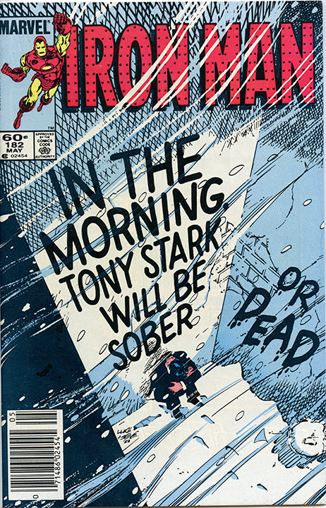
One of my regular monthly assignments in those bygone days of yore was to letter IRON MAN Comic Book, which was then written by the legendary comics writer, Denny O’Neil of Batman fame.
Here’s how it worked: Basically, the writer would discuss the story arc and the plot line for the series with the editor, who in this case was the late, great, much-loved and greatly-missed Mark Gruenwald. Ideally, the penciller, in this case the talented young artist, Luke McDonnell, would be called into the office to sit in on the editorial discussion, since it would be his responsibility to break the plot down into a series of pages, each page comprised of a number of panels, sequentially delineating the 22-page story. The rest of the book would be made up of advertising, a letters page and perhaps an editorial page hyping the next issue.
In those days, it was not unusual for there to be a printrun of several hundred thousand copies.
Then, after the story had been “penciled“, a full-size photocopy was generally made and that was given to the writer, who would then examine the “artwork” and using a “typewriter” produce a “script” consisting of all the dialogue—and captions (Suddenly, Meanwhile, Later, Soon, etc.), (the “dialogue” is what each character was actually saying) in the “balloons”. Then the pages of art, or the “boards,” as we called them– and a photocopy of the pages with a numbered guide or “balloon placement” for each page were given to the letterer, along with a typewritten “script” from the writer, in this case, the aforementioned Denny O’Neil.
Next, the letterer would transfer the “balloon placement” to the pages themselves, attach the pages to his drawing table with pushpins, rule in all the guidelines in hard lead pencil, rule the borders of the pages in ink using a Rapidograph® pen, letter in all the titles, dialogue, sound effects, and signage (if any) and perhaps the next issue blurb. Then the letterer would draw “balloons” around all the dialogue by hand which he or she had “lettered in”, add thought bubbles or pointers going toward whoever was speaking, rule in the borders, proofread all the work, fix any mistakes and then hand the job in to the editor who would then send the pages out to an inker or “finisher” to be inked. At Marvel, in those days, the inker and the penciler were rarely the same person.
That’s how it was supposed to work.
Naturally, because of the monthly schedule, it was incumbent on the creative team to find ways to save time in the interests of keeping things moving along and getting the books to the printer like clockwork, getting them on the trucks and getting them distributed to the readers. And, oh yeah, keeping the Men in Suits from jumping on our backs.
Comic book readers do like to get their books on time. Trust me on that one.
One way I saved time on my end, was by employing an assistant to transfer the balloons, rule the guidelines for the lettering and draw the borders on all the pages. That left me free to devote my skill to lettering the dialogue directly on the artwork and to save more time, I skipped the step of penciling in all the dialogue before lettering it. I got to be pretty good at estimating how many words would fit on each line in a balloon so that when I was done, I could draw a nice symmetrical oval-shaped balloon around the dialogue. This method saved an enormous amount of time and worked very well for me, most of the time and I produced over 30,000 pages over a fifteen year “career”, working day and night.
If I made a mistake, and mistakes do happen, the editor or assistant editor and sometimes, the editor in chief would usually catch it. Usually, but not always. Then, someone in the production department whose job it was to fix lettering mistakes would fix it. (it was my job for six years before I went under contract).
In the Iron Man comic book, it seems the main character, the hero of the book, Tony Stark, had developed a drinking problem and was not behaving very….well, very heroically. In fact, he was found by an ordinary citizen lying in the gutter! After some frantic discussion among the comic book characters in the story about what do do, where to take him, it was determined that IRON MAN, a.k.a., Tony Stark, be rushed to the nearest hospital for treatment and possible rehabilitation.
The script looked like this:
CHARACTER: St. Vincent’s is the closest.
(But that’s not what I saw….)
I saw….
CHARACTER: St. Vincent’s in the closet.
And, yep, you guessed it! Nobody caught the mistake. Not the assistant editor, not the editor, nor even the editor in chief.
“St. Vincent’s in the closet” got lettered and then printed in about 375,876 comics books.
So, as fate would have it, a new hip term entered the American vernacular.
“St. Vincent’s in the closet”.
Did it refer to homosexuality in the clergy? Was it some kind of comment about Catholicism?
Or was it just a stupid mistake?
My friends, only you, the comic book readers, can ever truly know the answer to that question.

Hahaha this is one of the best behind-the-scenes Marvel stories I’ve ever heard/read.
LikeLike
“I skipped the step of penciling in all the dialogue before lettering it,” and your production of 30,000 pages in 15 years, are the most amazing parts of this story for me. Thanks for sharing.
LikeLike
I loved this run, this issue in particular, but haven’t read it since the 1980s. I wonder if they fixed that in a recent Epic Collection volume? Your blog post just captures change so well.”St. Vincent’s in the closet.” Indeed!
LikeLike